You'll find this post at several Linky Parties. Please check them out for some great ideas.
Tuesday, January 31, 2012
Wordless Wednesday #4- Educated Butterfly
Be sure to see Web View for More-- Posted by
JOY @ http://joysjotsshots.blogspot.com/
at
9:48:00 PM
18 comments:

Sunday, January 29, 2012
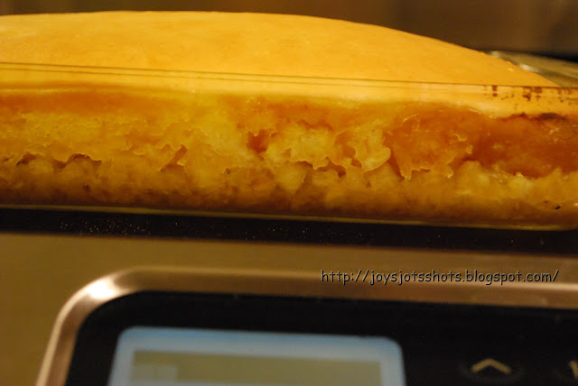
No Sugar Added Upside Down
You'll find this post at several Linky Parties. Please check them out for some great ideas.
This recipe was even enjoyed by those that don't have to watch their sugar levels. I added no extra sugar other than what comes naturally in pineapple.
enJOY!
 |
| I like crushed best. Make sure you DO NOT get pineapple packed in syrup. |
This is a Kroger brand and they didn't have another brand name to offer. The package ingredients listed are: Xylitol, maltodextrin, molasses and sucralose. Calories= 0 and Sugars= 0. No after taste and keeps a sweet taste when mixed in recipe, unlike Splenda.
 |
| Note: this cake mix does have white flour. |
After glow thoughts:
* Use 2 cans of pineapple
* The white flour in the cake mix is on my no-no list. Trying to make a whole white wheat cake, but haven't found one that is light and sweet tasting yet. I hope someone out there in web world has one to share.
* What other fruits can I try?
Be sure to see Web View for More-- Posted by
JOY @ http://joysjotsshots.blogspot.com/
at
2:00:00 PM
13 comments:

Friday, January 27, 2012
Something Old, Something New (Porch Light)
You'll find this post at several Linky Parties. Please check them out for some great ideas.
From a previous post, I showed the outdoor Christmas decorations.
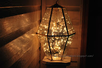
When I took the lights off the 3 trees on the porch, I took them to the garage to store them when I noticed the old kitchen light fixture I hadn't gotten rid of yet. So, I stuffed the string of lights into the light fixture and decided to see what it would look like.
While some folks are totally turned off by brass, I don't mind it especially in a setting like this. Funny who determines what is nice looking. While old stuff is the thing, there seems to be a fine line between what is retro and what is outdated. Who makes those laws? During daylight you can tell its brass but when the sun goes down, who knows the difference? Beauty is in the eye of the beholder.
Like the Christmas lights, these lights work off the timer.
Now to decide about something to go under the kitchen window again. I take my time about these things and when I see it or think of it, I'll know its right in a matter of seconds. Yes, there definitely needs to be some work done on landscaping. That comes in time as well.


Be sure to see Web View for More-- Posted by
JOY @ http://joysjotsshots.blogspot.com/
at
8:02:00 PM
31 comments:

Wednesday, January 25, 2012
Wordless Wednesday #3- Guiding Hand
Be sure to see Web View for More-- Posted by
JOY @ http://joysjotsshots.blogspot.com/
at
9:26:00 AM
8 comments:

Saturday, January 21, 2012
Close-ups without a Powerful Lens
The
part of my education career that I enjoyed the most was when I was a
Technology Resource Teacher AND anytime I had the opportunity to
share anything technical as I did my last 3 years of my career. Even
the short period of time I had to return to the classroom, I was
still proud to be a tech resource person for my friends. Something
is always changing or evolving everyday in the technology world. So,
no matter your age, there is always something to learn.
This
is the MAIN reason I wanted to do a blog. To continue to use my
skills and to share any discoveries of any of my interests.
This
post is one of those discoveries I have made.
Recently,
I decided I felt I wanted to start watermarking my photos I posted.
Through some research and eventually to a blog tutorial @ Mommy's
Camera, I found the free software, PhotoScape
and used the “Batch File” tool. Wow, so fast once you set up
your text. I also found I could do some of the basics I was using in
GIMP (also free.) With these two
programs I have absolutely no need for the expensive Photoshop
program.
One
more note- Since I'm always up for finding free software, to make this
post I also used OpenOffice
Draw which is the equal to MS PowerPoint, and then the good ole Paint program
that comes on all PCs I've ever used (& that's a lot) to turn
what I made in OO Draw to jpegs.
So on
to today's discovery.
Creating
Close-ups without a Powerful Lens
I'm
not sure how the PhotoScape authors intended us to use the Splitter
tool, but here is my use.
This
picture (from my backyard)
was
taken with this zoom lens that came on my Nikon D60:
I
chose the “Split” tool in PhotoScape
to
do this to my picture. Don't worry, when you save the new split, the
program automatically makes another folder inside your folder to save
your new work. However, I
always make a backup folder of all my pictures I'm working with just
in case I make a human error.
Notice
you can add more rows/columns to cut the picture up as you like it.
(What about making puzzles for your kids or a large piece of wall
art?)
After
I split the picture it came out like this:
It's
fun to see how they turn out. The details pop out even more in some
pictures, while others have nothing. Here are the pieces I thought
were the most interesting. I found for the split pictures to be so
clear, the original picture needs have high, crystal clear quality.
Let's
do one more-
This
picture (from my first retirement trip)
was
taken with this typical lens that came with my Nikon D60
Split
the picture with PhotoScape 3x3 and got these:
Even
when I look at it above, I don't get the true perspective until I
look at them individually. To me, most of these turned out with
interest, especially pattern (maybe because all of it is in focus?).
This was the only one out of the 9 I didn't like.
I hope
you also have fun splitting pictures.
I've
got to share one more.
My
Father's hand- it unexpectedly popped up in a set I had done. I'm helping to care for my Dad right now, so this picture of his "guiding hand" meant a lot to me. He loves to read his newspapers.
Be sure to see Web View for More-- Posted by
JOY @ http://joysjotsshots.blogspot.com/
at
7:10:00 PM
8 comments:

Subscribe to:
Posts (Atom)


